Introduction
In this guide, you will learn how to access and utilize your personal performance data.
Navigation
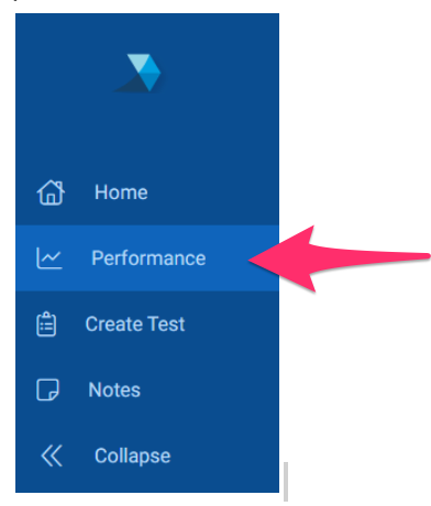
When logged into your TrueLearn member account, you will see a navigation menu on the left hand side of your screen. Click on the “Performance” tab to access your performance data specific to the subscription being viewed.
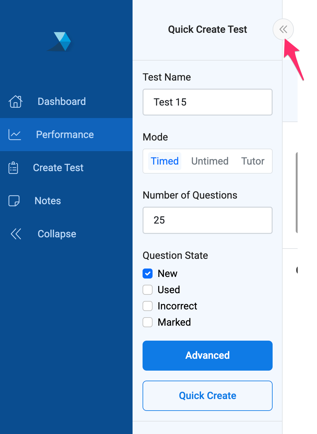
For convenience, you will see a “Quick Create Test” box on your Performance page. Test creation will be covered in our Create Test guide. You may choose to leave this box expanded, or collapse it by clicking the double arrow symbol.
Subscription
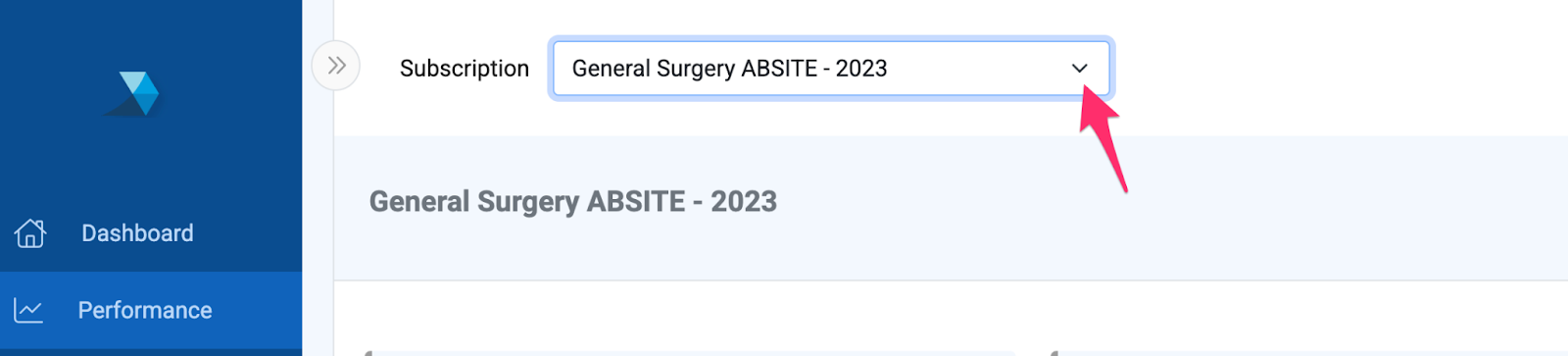
The “Subscription” dropdown at the top of the page will allow you to change between any subscriptions you have currently available.
NOTE: If you have not yet activated your personal subscription, then you will need to navigate to Account Settings and activate the subscription in order for it to display in this dropdown. See this guide on activating personal subscriptions.
The header bar will display the subscription you are viewing, as well as your Exam Date and Goal Percentile, if they have been added. These may be added or updated at any time by clicking the “edit” icon that displays next to each.

Some subscriptions will offer a “Compare To” dropdown menu, which will allow you to compare yourself to specific graduation years.

NOTE: Data on the Performance tab can take up to 15 minutes to update after completing tests.
Performance Cards
At the top of your performance page you will see three score cards displaying a summary of your performance.

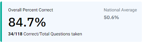
The “Overall Percent Correct” card will show your overall score, and how your score compares to the national average. This card will display as green if your overall score is higher than the national average, red if it is below average, and gray if in the average range. You will also see in this card how many questions you have taken overall, and how many you have answered correctly vs. incorrectly.
Your “Percentile” card will show where you stand in comparison to all others using the same subscription. This card will display as green if your percentile is higher than the national average, red if it is below average, and gray if in the average range. If you have entered a goal percentile, you will see where you currently stand in reaching the goal you have established.
The percentile is calculated by taking the overall scores of all members over the past year, and bucketing them based on performance.

The “Total Questions Taken” card displays how many questions you have taken overall, including questions you have taken more than once, how many unique questions you have taken, and your percentage of bank completion.

Question Scores Graph
This graph shows you your percent correct for questions answered across time.
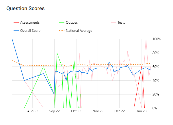
In the legend above the graph, you can select the item to remove the corresponding line from the graph. The line can be added back to the graph by selecting it a second time.
In the “Question Scores” graph, the lines represent your performance as indicated below:
- Overall Score: This line represents a rolling average of your scores.
- National Average: This line shows the National Average benchmark for the same questions taken.
- Tests: This line shows performance specific to your self-created tests.
- Assessments: This line shows performance specific to assessments, whether institutional or retail.
- Quizzes: This line shows performance specific to quizzes assigned by your institution (appears for institutional subscriptions only).
Hovering your cursor over the graph will allow you to see details for specific dates.
To zoom in on a specific date range, use your cursor to select a start date on the graph, and then drag and drop on the final date you would like to see. You can return to the original view by clicking the (-) sign found in the top right hand corner of the graph.
Question Usage Graph
This graph shows you the number of questions you’ve answered across time.

In the legend above the graph, you can select the item to remove the corresponding line from the graph. The line can be added back to the graph by selecting it a second time.
In the “Question Usage” graph, the lines represent your performance as indicated below:
- Total Questions Taken: Represents the number of questions you have taken, including questions you have taken more than once.
- National Average: This line shows the national average for questions taken.
- Tests: This line shows data specific to your self-created tests.
- Assessments: This line shows data specific to assessments, whether institutional or retail.
- Quizzes: This line shows data specific to quizzes assigned by your institution (appears for institutional subscriptions only).
Hovering your cursor over the graph will allow you to see details for specific dates.
To zoom in on a specific date range, use your cursor to select a start date on the graph, and then drag and drop on the final date you would like to see. You can return to the original view by clicking the (-) sign found in the top right hand corner of the graph.
Category Performance
This table shows you your performance for specific categories.

In the Category Performance table, you can choose an axis from the dropdown, for example, “Blueprint” or “Body System,” and all of the subcategories will display in this section with your performance compared to the national average.

You can also select a subcategory within the axis to view your performance for just that category only.
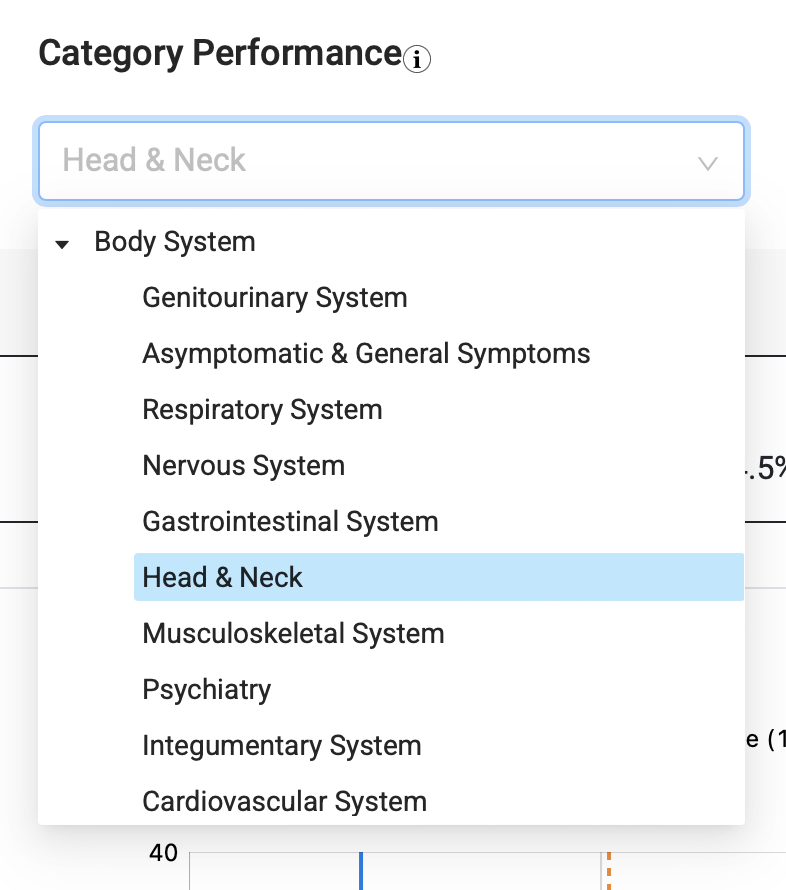
On the right side of this table, you will see the number of questions you have taken in each category, and how many questions you have answered correctly vs. incorrectly, helping you to determine areas where improvement may be needed.
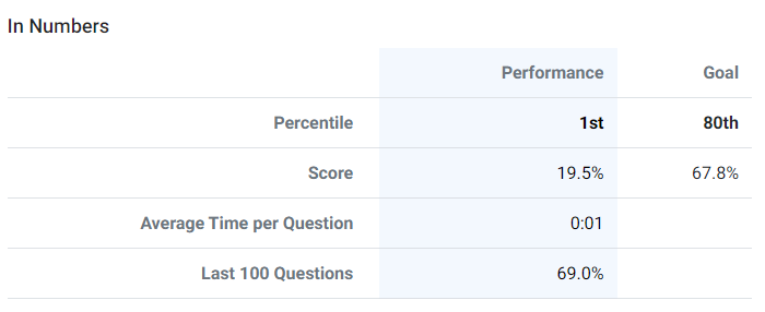
Percentile
This graph gives you an overview of your current Percentile compared to the National Average. If you have entered a goal percentile, that will display on the graph as well, indicating what overall percent you need to achieve to reach your goal.
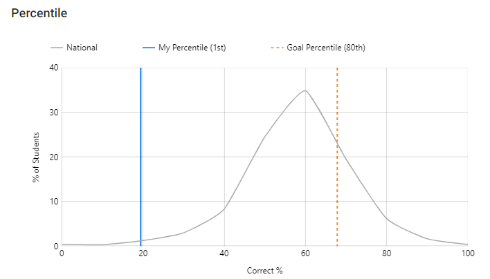
The table to the right of the Percentile graph displays your percentile and overall score compared to your goal, as well your average time per question, if you have taken any questions in timed mode, and score for the last 100 questions taken