Overview
Summary Reports provide you with clear and detailed insight into your performance on each Test, Quiz, or Assessment. These insights include overall performance, decision or answer-change analysis, average time spent on questions trends, aggregate performance by each category covered, and individual item performance with comparative analytics provided throughout the report.
Research shows that regular self-reflection can significantly enhance learning performance and progress, leading to better academic and licensure exam outcomes. Reviewing the Summary Reports following each Test, Quiz, or Assessment is a great way to engage in self-reflection and to identify areas that need further focus, whether related to content or testing skills.
Accessing Summary Reports
Tests and Quizzes
You can open the Summary Report for Tests and Quizzes from the following three places:
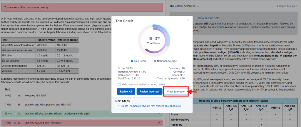
1. Test Result Modal — after completing a test, select “Review Test” then click the new “View Summary” button.
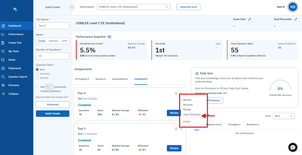
2. Dashboard Test Card — in the assignments table, select the “Completed” tab, then click on the three-dot menu and select “View Summary.”
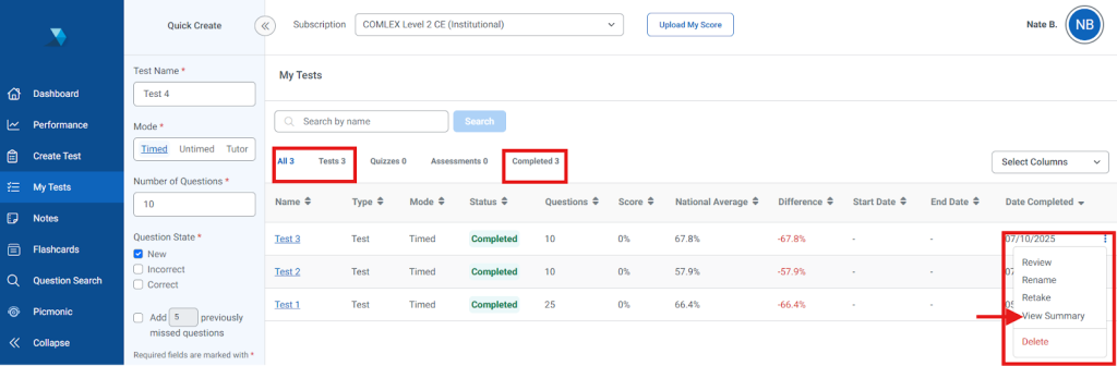
3. My Tests Page — open the three-dot menu for either the “Tests” tab or the “Completed” tab and select “View Summary.”
Note: The report will open in a new browser tab.
Assessments
Mock Assessments are available to purchase for many of TrueLearn’s SmartBanks. Many institutional subscriptions also include a mock assessment, which will be assigned by your program. Learn how to access assessments here.
Each Mock Assessment includes a Summary Report. Learn more about Assessment Summary Reports here. For information on COMLEX Assessments, go here.
Performance Data
Summary Cards
The Summary Cards are the first set of data you should review after opening your summary report. These summary cards provide you with a quick overview of how well you performed on your test or quiz, and how your performance compares with other learners. Let’s now walk through each summary card to help you understand what it’s telling you.
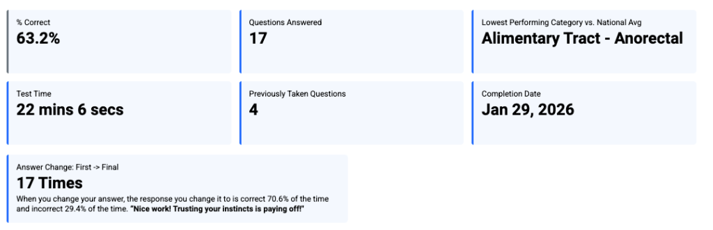
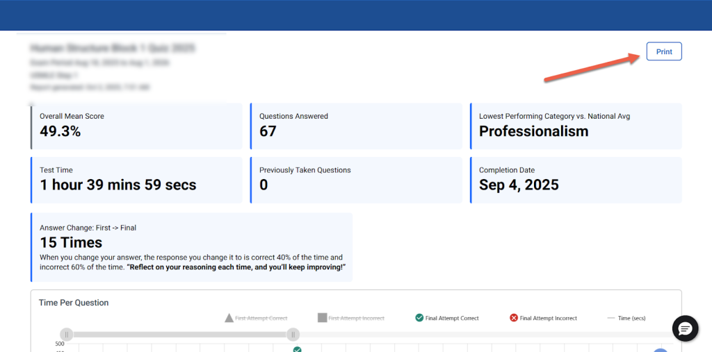
% Correct: This is your raw accuracy (percent correct). Specifically, it is the percentage of questions you answered correctly on questions in this specific Test/Quiz/Assessment. A score of 57.7%, for example, means you answered 57.7% of the questions correctly on this attempt. The Percent Correct score gives you a baseline for your understanding and mastery of the content on your assessment. The higher your score, the more you understand the material. If your score is lower than expected, you will want to identify the material where you require the most improvement. It is suggested that you review the Question Performance and Category Performance tables of your report to help you identify your weakest areas to target additional study for improvement.
Test Time: This is the total active time you took to complete the Mock Assessment.
Questions Answered: This is the number of questions answered for the Mock Assessment.
Lowest Performing Category vs National Avg tile tells you which topical category you answered incorrectly compared to national averages. It gives you a snapshot of your least performing category.
Interpreting the Time Per Question and Decision Analysis Metrics
The Answer Change: First → Final Card, Time Per Question graph, coupled with the Average Time Cards, provides you with holistic information about how you spent your time when taking your test or quiz. It shows you how much time you spent on each question, whether you answered the question correctly, and if your final answer was different from the first response you chose.
Spending a few minutes to review this information will help you identify content areas where you need to improve your knowledge and behaviors related to test-taking skills.
Answer Change: First → Final Card
The Answer Change tile will display the total number of questions where you changed your answer during the test or quiz. Based on questions where the answer was changed, the percentage of times the change was to the correct versus incorrect answer will be presented. To help you visualize answer changes, refer to the Time Per Question graph.
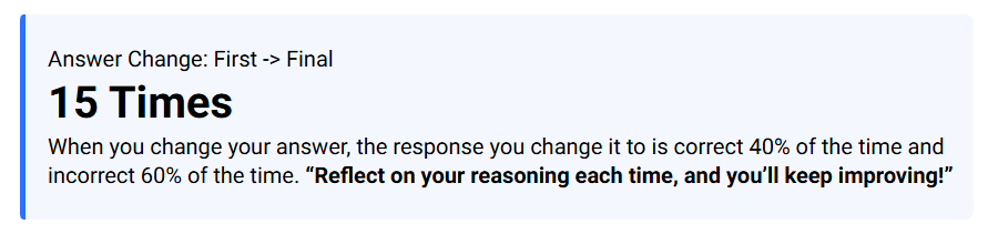
Note: If you did not change any of the answers while testing, then this card will not appear in the report.
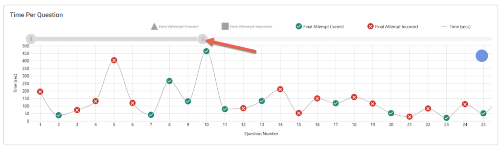
Time Per Question Graph
The Time Per Question graph displays up to 25 questions upon loading the report. To view more questions in the graph, select the right-hand endcap on the grey slide bar above the graph and drag it to the right to display more questions in the graph. Alternatively, move your cursor over the graph and use the mouse scroll button to zoom out and in.
Default View (up to 25 questions displayed in the graph):
Expanded View:
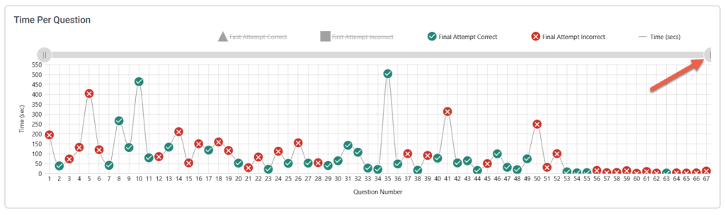
The Question Number is displayed below the graph on the X-axis. Each question answered will be plotted on the graph with either a green circle with a checkmark to indicate it was answered correctly or a red circle with an “X” to indicate it was answered incorrectly.
The Time (in seconds) Per Question is displayed on the left of the graph on the Y-axis. Each answer icon will be plotted vertically based on the time you spent on that particular question. To see the exact time (in seconds), hover the cursor over the icon. At a quick glance, you will be able to see which questions you spent significantly more time on and those that were quick guesses.
Use the grey slide bar to bring all questions on the test or quiz into view so you can identify questions that you spent a long time answering. These are the questions that you most likely found the most difficult, especially the questions that you answered incorrectly.
By default, the decision analysis portion of the graph is turned off, but you can click the “First Attempt Correct” and “First Attempt Incorrect” legend above the graph to see where you changed answers. When turned on, your first attempt on a changed answer will be shown as a blue triangle (correct) or a blue square (incorrect).
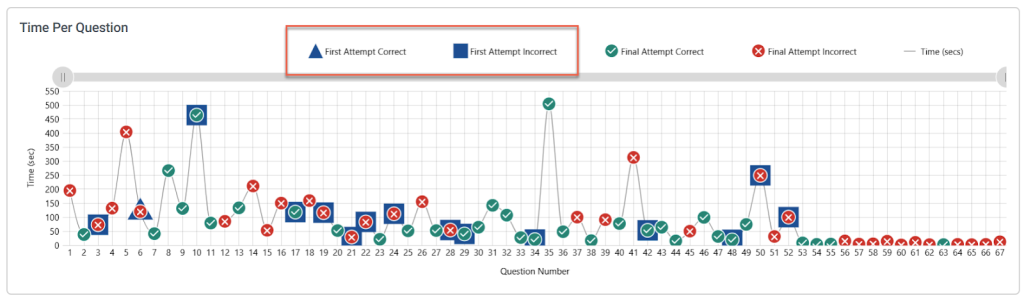
For the questions that you answered incorrectly, take notice if you frequently changed your answer from correct to incorrect. The incorrect questions where you changed your answer may suggest content where you only have a partial understanding or misconceptions that require additional review. Use the Question Performance table to review these questions carefully. Also, keep in mind that spending a lot of time on questions that you answered correctly may indicate that you are using extra time to ensure accuracy.
Take a look at the full distribution of questions and time spent over the duration of the exam. The goal here is to identify whether your test performance was consistent throughout the exam or if there were fluctuations. Spending more time on the questions or answering more questions incorrectly at the end of the exam, for example, may indicate that you experienced fatigue or loss of focus due to loss of stamina or simply ran out of time and started guessing.
Reviewing the decision analytics within this graph (and within the Question Performance table) soon after taking the test or quiz provides insights into your test-taking behavior and cognitive processes. Here are some of the key benefits of taking a few minutes to review the information:
- Promotes Metacognition – Analyzing why you changed an answer—reasoned decision, panicked guess, or memory issue—forces you to think about your thinking process (metacognition). This deep reflection is crucial for transferring knowledge and improving performance on future practice tests.
- Focuses Study Efforts – By identifying questions where initial guesses were often wrong but final guesses were right (or vice-versa), you can more precisely target your study time to those content or topic areas.
- Identifies Test-Taking Habits – You can see at a glance if you are frequently changing from the correct to incorrect (you could be second-guessing yourself), changing from incorrect to incorrect (you may have a deep knowledge gap to address), or changing from incorrect to correct (you spent extra effort in rethinking).
Average Time Cards
The Average Time per Question, Correct Answer, and Incorrect Answer cards provide insight into these respective areas for tests or quizzes taken in Timed Mode.

Category Performance
The Category Performance table provides a summary of your performance across the categories of content tested on the test or quiz. This table groups together questions that are associated with the same category and reports your performance. Keep in mind that each question may be associated with one or more categories. By using the data in this table, you can quickly identify the areas of content where you need additional study.
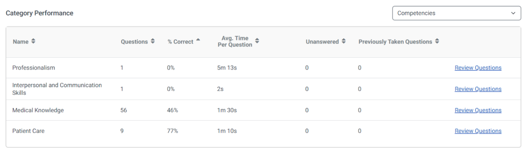
Name
The Name column lists the category or categories that you have selected from the drop-down menu above the Category Performance table. You can use this drop-down to select the categories that you are interested in reviewing. It is very important to highlight that the Question Performance table automatically updates after using this drop-down to select a category to show your performance for questions in your selected category.
Questions
The Questions column reports the number of questions on your assessment linked to each category. Questions may be associated with one or more categories.
% Correct
The % Correct column shows the percentage of questions in each category that you answered correctly on your assessment.
Avg. Time Per Question
The Avg. Time Per Question column shows the average time that you spent answering questions associated with each category.
Unanswered
The Unanswered column shows the number of questions on your assessment that you did not answer in each category.
Previously Taken Questions
The Previously Taken Questions column shows the number of questions in the test or quiz that you have previously taken on another test or quiz.
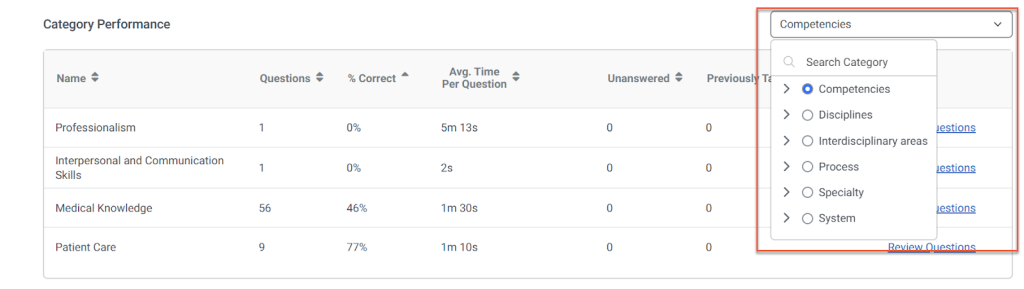
The Category Performance table reports your performance for all categories tested by the assessment. The drop-down menu above the Category Performance shows you the currently selected category. For example, in Figure 6, the category currently selected is Body System. You may click on the drop-down menu and select a different category. The Category Performance table will automatically update to report your performance by the category you selected.
Changing Categories Displayed
The drop-down menu above the Category Performance shows you the currently selected category. You may click on the drop-down menu and select a different category. The Category Performance table will automatically update to report your performance by the category you selected.
It’s also important to recognize that the categories are organized in a hierarchy. Specifically, there are two levels of categories. The first is the top-level category. The second is the second-level category. If you select a top-level category, the Category Performance table will update to show you performance for all second-level categories associated with your selected top-level category. You may also select a second-level category using this drop-down menu. In this case, the Category Performance table will only show the single second-level category that you selected.
Using Category Performance to Focus Studies
Now that you understand what each column in the Category Performance table is telling you and how to select different categories, let’s learn more about how you can use it to review your performance.
The Category Performance table provides you with critical information for identifying your weakest areas of understanding so that you can strategically target those areas for improvement with future study.
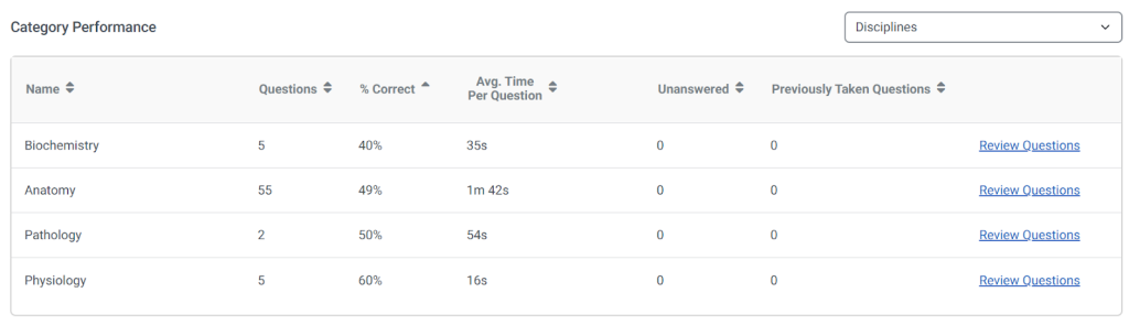
First, you should review the Category Performance table to identify the categories where you underperformed. By focusing your review on your underperforming categories, you will best target the material on the test or quiz where you are weakest. Improving your performance in your weakest areas is key to increasing your future exam score or outcome. The drop-down menu shows you all the categories tested on your assessment. Select the first top-level category. The Category Performance table will update to show you only the secondary-level categories associated with the top-level category that you selected in the drop-down menu.
Next, notice how the % Correct column is in ascending order (showing your lowest performing categories at the top). Identify the second-level categories where your % Correct is 50% or less. These are the second-level categories where you most underperformed and should focus your future study for improvement. For each second-level category where you scored less than 50%, click on the “Review Questions” link.
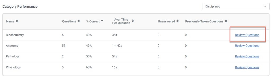
This link will open the “Review Questions” interface. Here, you can focus your review only on the questions associated with the second-level category that you selected.
As you review each question, think about the reasons you selected the wrong response option when taking the test or quiz. Compare and contrast your understanding of the question with the explanation and the Bottom Line. Identify where your understanding is incorrect and update it during your review.
You should repeat this exercise to review all questions you answered incorrectly within each second-level category where your % Correct is less than 50%. Take your time when conducting your review. Focus on a single second-level category, one at a time, and systematically work through each question. As an additional step in your review, consider creating a new practice test with random questions just from the second-level category you are reviewing. Practicing on questions associated with the categories where you underperform is a great way to focus your study in a targeted manner and make the best use of your review time.
Question Performance
More summary cards are provided in the Question Performance section to help provide a quick snapshot of helpful insights.
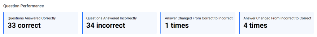
- Questions Answered Correctly – Displays the total number of questions you answered correctly during the test.
- Questions Answered Incorrectly – Displays the total number of questions you answered incorrectly.
- Answer Changed From Correct to Incorrect – Shows how many times you originally selected the correct answer but changed it to an incorrect one before submitting.
- Answer Changed From Incorrect to Correct – Shows how many times you originally selected an incorrect answer but changed it to the correct one before submitting.
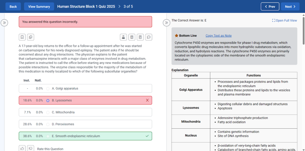
The Question Performance table shows your performance on each question on your test or quiz. Beyond summarizing which questions you answered correctly versus incorrectly, this table is very useful for helping you identify the material on the test or quiz where you need the most improvement.
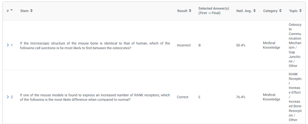
Question Number (#)
The Question Number (#) column shows the order of each question as it was presented to you when you took your test or quiz.
Stem
The Stem column shows the first one or two sentences in the question. You may click on a question’s Stem column, and the table will expand to show the full Stem for the question, as well as its response options (the bolded option indicates the correct answer). The question’s bottom line, which provides a short explanation for the correct answer, is also shown below the question stem and response options.
Result
The Result column reports whether you answered each question correctly or incorrectly.
Selected Answer(s) (First → Final)
The Selected Answer(s) column reports the response option you selected as your answer for each question on your test or quiz. This column also shows you the first and final response option you selected for each question if your first selection differed from your final selection.
National Average (Natl. Avg.)
The National Average column reflects the percentage of learners nationwide who also took the question and answered each question correctly, providing a benchmark for the difficulty of each question.
Category
The Category column reports the category associated with each question. It is important to highlight that each question may be associated with one or more categories.
Topic
The Topic column shows the topic associated with each question. Each question is associated with one and only one topic.
Now that you know how to read the Question Performance table, let’s learn about how you can use it to help you better understand your performance on your assessment.
Using Question Performance to Focus Studies
The Question Performance table is critical for helping you to identify where you need to target your study for improvement. It shows you how you performed on each question and allows you to directly target individual questions for review.
First, identify and review each question that you answered incorrectly. For each question that you answered incorrectly, review the National Average (Natl. Avg.) for the question. Remember, this provides a benchmark for question difficulty. The higher the national average, the more learners who answered this question correctly.
Focus on the questions that you answered incorrectly that report a high national average. These are “easy” questions that you missed. Click on the question in the Stem column to review the question, response options, correct answer, and bottom line.
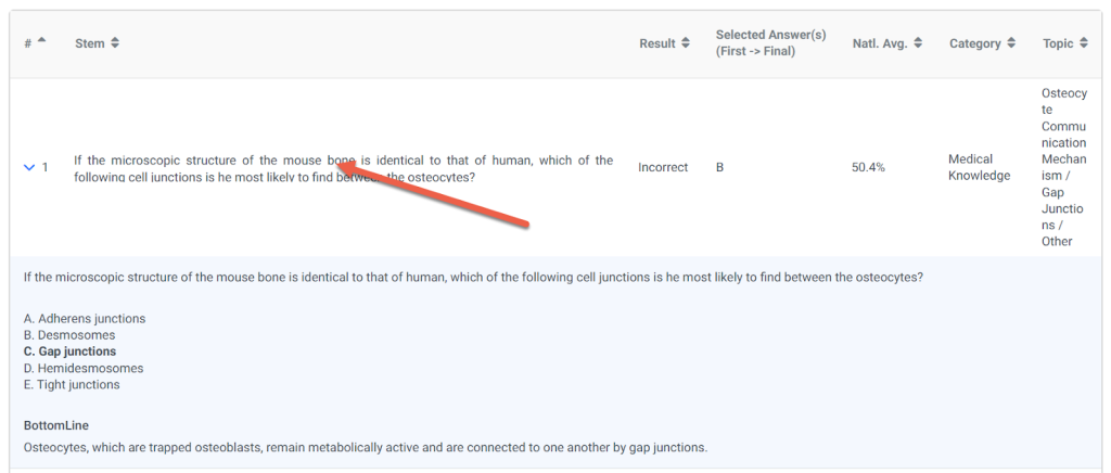
Selected Answer(s) (First → Final) column will show if you changed your answer while taking this question.
Printing Summary Reports
If you want to save a copy of the Test or Quiz Summary Report, click the “Print” button in the top right corner of the Summary Report page. All data within the Summary Report will be displayed in the PDF.
Tip: Your screen resolution affects the layout of the PDF generated when using the print option. For the best results, close any extra windows or panes on your screen before creating your PDF.
Here are a few important things that you should know about the printed Summary Report:
- The Print option will create a formatted PDF of the Summary Report for download.
- The Time Per Question Graph in the PDF will only display the first 25 questions, regardless of whether you have expanded the view of the graph.
- The Category Performance section will list all second-level categories within the report. These will be grouped by the first-level categories, but the actual first-level categories (i.e., Body System, Discipline, Blueprint) will not be displayed in the report.
- You do not have to expand the Category Performance of Question Performance tables before clicking the “Print” button.
- The Question Performance will list all questions in the test or quiz, but only the first portion of the question stem will be included.